The short version. The golden-age poster look is a set of techniques, not a set of images: flat lithographic colour, a limited palette, a hard diagonal, print grain, romance about travel. Those techniques are available to anybody. The specific old posters aren't, which is why so much of what sells under this heading is a photograph of somebody else's work.
Where the poster idiom came from
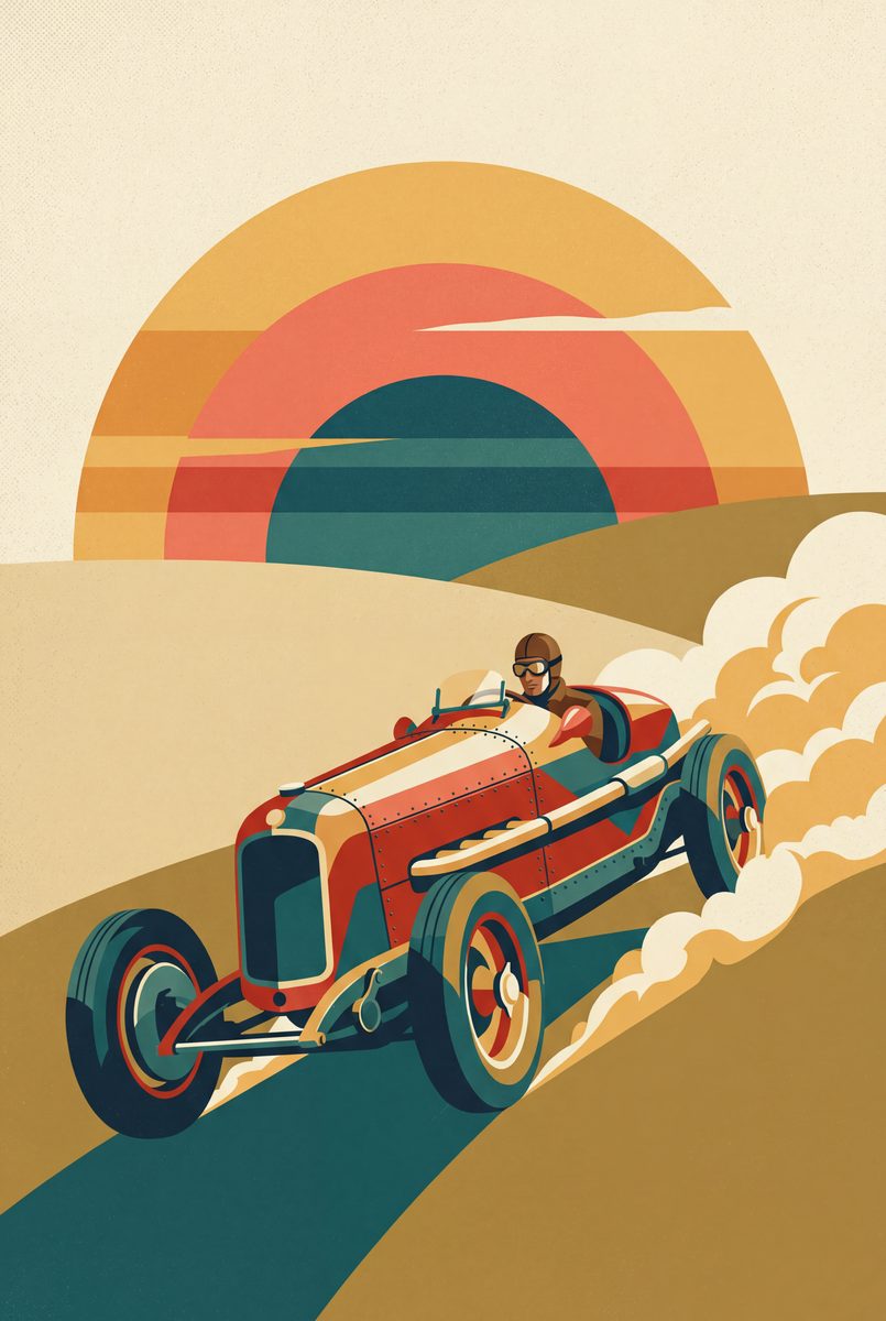
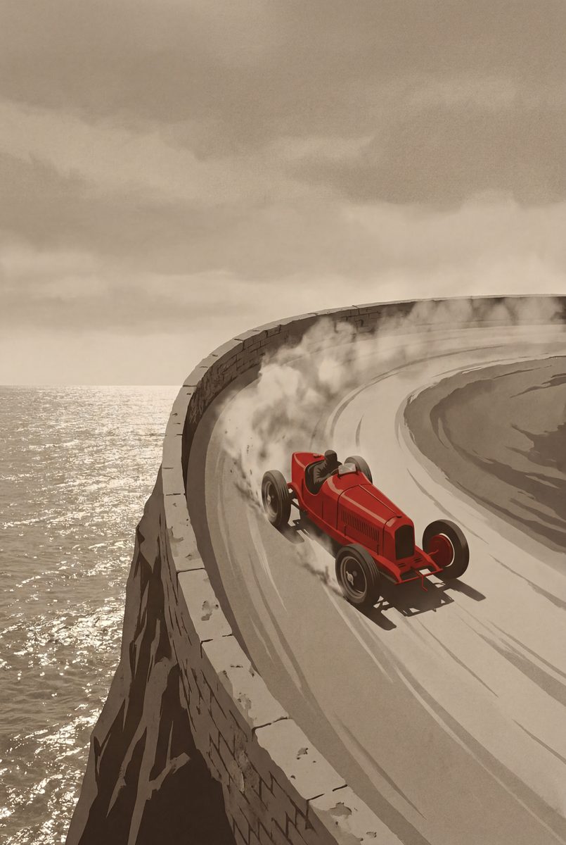
Two of these are made the way an event would have been advertised at the time. Apex at Dawn is a 1930s open-wheel racer cresting a hill at sunrise, dust trailing, in ochre, cream and signal red. The Hairpin puts a vintage racer mid-drift on a cliffside bend above the sea, tail wide and dust flying, which is how period posters showed motion without a blur.
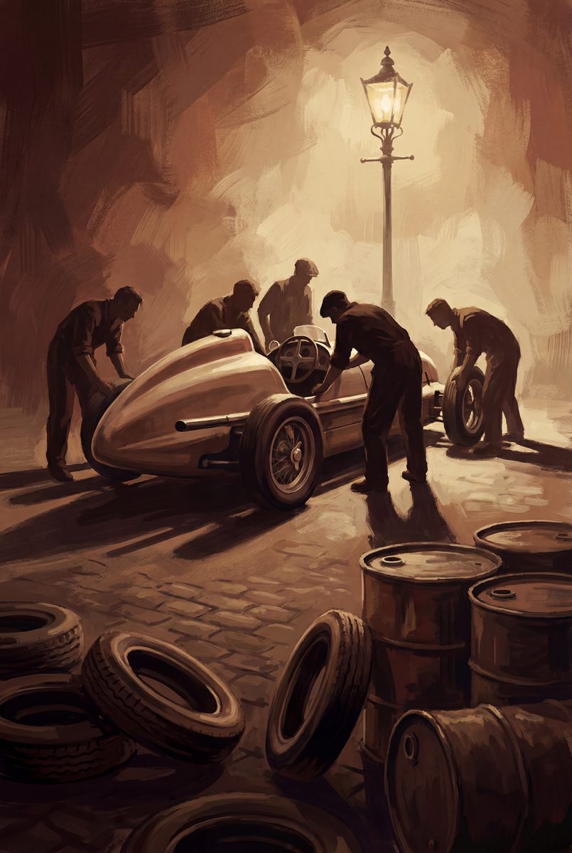
Pit Lane, 1955 is deliberately un-period in subject. No one advertised anything with a picture of mechanics swarming a stripped racer under a lamp, which is why it looks fresh next to the other two.
The workshop, and the calm one
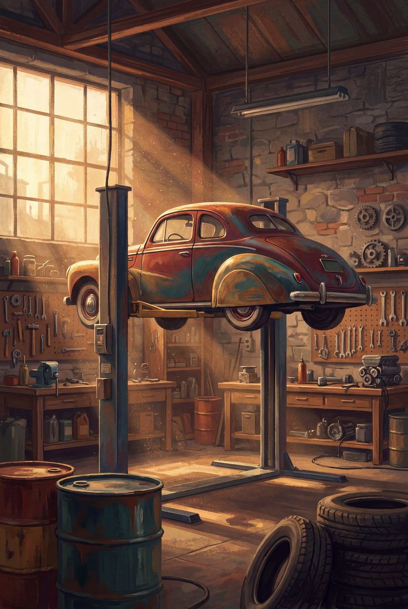
The Workshop puts a classic up on the lift with tools on the wall and dust hanging in golden light. It is about ownership, not driving, and it is the one people buy for somebody who spends their weekends underneath something.
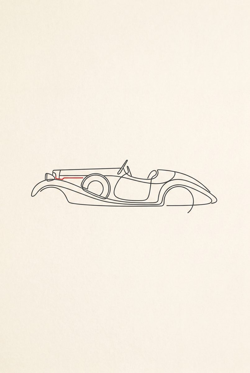
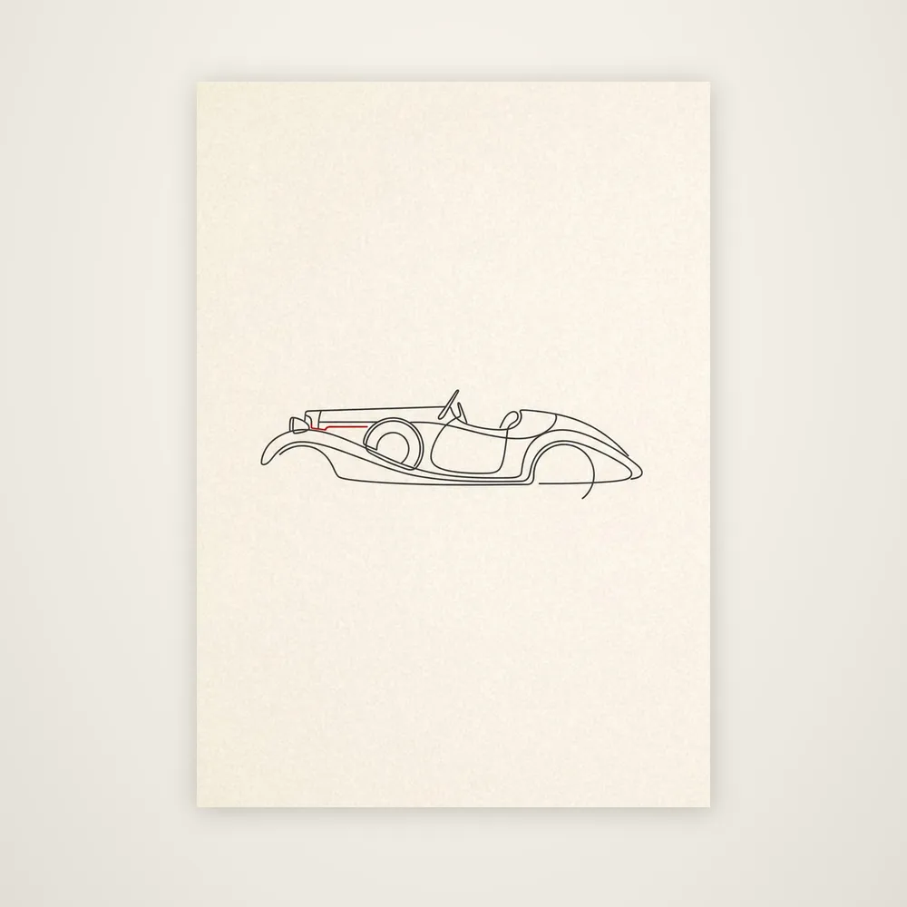
1930: The Roadster sits here as the outlier: the same decade as Apex at Dawn, as a single continuous line on cream paper, not as a scene. If you want the period without the drama, it's the calm answer, and it hangs well in a shared room where a loud scene would fight the furniture.
What makes them hang well together
Three of these in a row along a hallway read as a collection, not as three posters, and the warm cream and ochre grounds of Apex at Dawn and the 1930 roadster sit better in a natural wood frame than a black one. If the racing half is what you're after, the racing page takes those pictures and argues them as sport. The wall is where size and framing get settled.
Related pages: F1 wall art · art deco car art · all car art