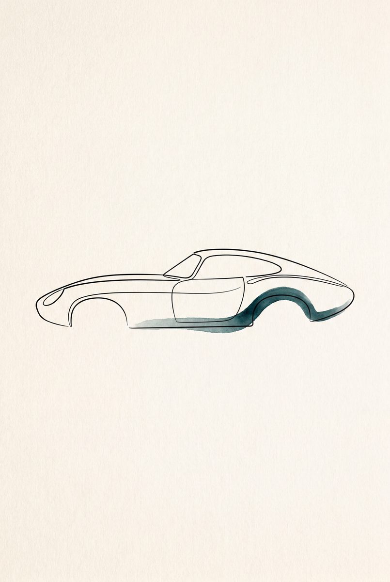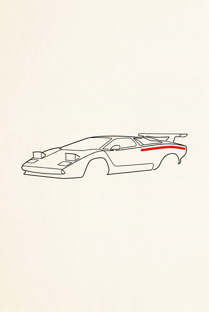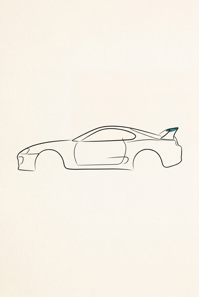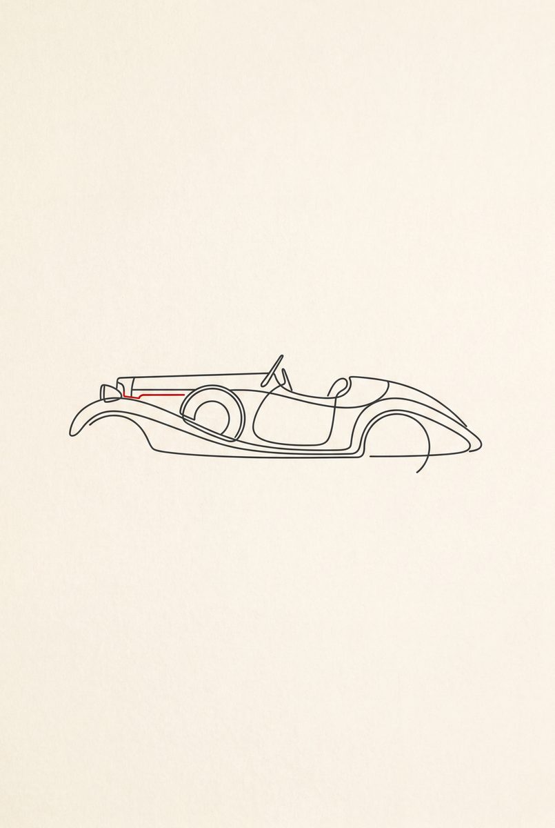
The short version. This page is about where the pictures go rather than how they were drawn. If you want the drawing argument, the silhouette page is about the technique. This one is about the fact that a hallway, a bedroom or a room somebody else also lives in usually cannot take a neon night scene, and this is what you hang instead.
Why minimal works where the rest does not
A busy picture needs a quiet wall around it. Most homes don't have one: there is furniture, there are other pictures, there is a colour on the wall somebody chose carefully. A line drawing on cream sits inside all of that without competing, which is why they're the four that get bought for shared rooms rather than for a study or a garage.
The other reason is scale. A detailed picture has to be big enough to read, so it commits you to a large frame. A single line reads at any size, so an A3 in a narrow gap between two doors still works, and four A3s in a row work better.
The set, and how many of it to buy
There are four, one per era: 1930, 1965, 1985 and 1995. Hung in order along a hallway they read as a timeline of what people thought fast looked like, which needs roughly two metres to breathe. Hung alone, each is simply a shape a visitor spends a moment working out, and that works in a much smaller gap.
Two is the awkward number. Two of the four invites the question of where the other two went, so either commit to the run or pick the single era that means something to the person it is for. What each drawing is doing is set out on the silhouette page.
Colour and framing
The cream ground is the thing to plan around. It's warm, so it sits happily on an off-white or a colour and looks slightly wrong against a stark brilliant white. Natural wood is the natural frame; black works but turns them into graphic design rather than drawings.
Your own car can be drawn the same way from a photograph, in the single-line style, through the Paint Shop. If you want the opposite of this page, all detail and no restraint, the blueprints are hundreds of lines instead of one. The wall deals with size and frame.